In the current digital era, building a robust online presence is paramount for professionals in various fields, particularly in design. To showcase my work, skills, and personal brand effectively, I embarked on designing a personal portfolio website. This UX design case study delves into the process of creating a portfolio website from scratch, highlighting the design journey, encountered challenges, and the ultimate success achieved.
As a designer, my goal was to create a personal portfolio website that not only showcased my work but also reflected my distinctive style, creativity, and professionalism. The challenge was to design a captivating and user-centric website that effectively presented my skills, experience, and projects to attract potential clients and employers.
The primary objective of this project was to design a visually captivating and intuitive portfolio website that would make a lasting impression on visitors. It aimed to effectively communicate my design expertise, showcase my best projects, and create opportunities for collaboration. My intention was to craft a visually appealing and memorable experience that reflected my unique identity.
UX designer leading the responsive website design from conception to delivery, handover design specs. and assets to developer for front end and backend coding
Market Research and analysis, user needs and preferences, paper and digital wireframing, low and high-fidelity prototyping, conducting usability studies, accounting for accessibility, iterating on designs, determining information architecture, and responsive design.
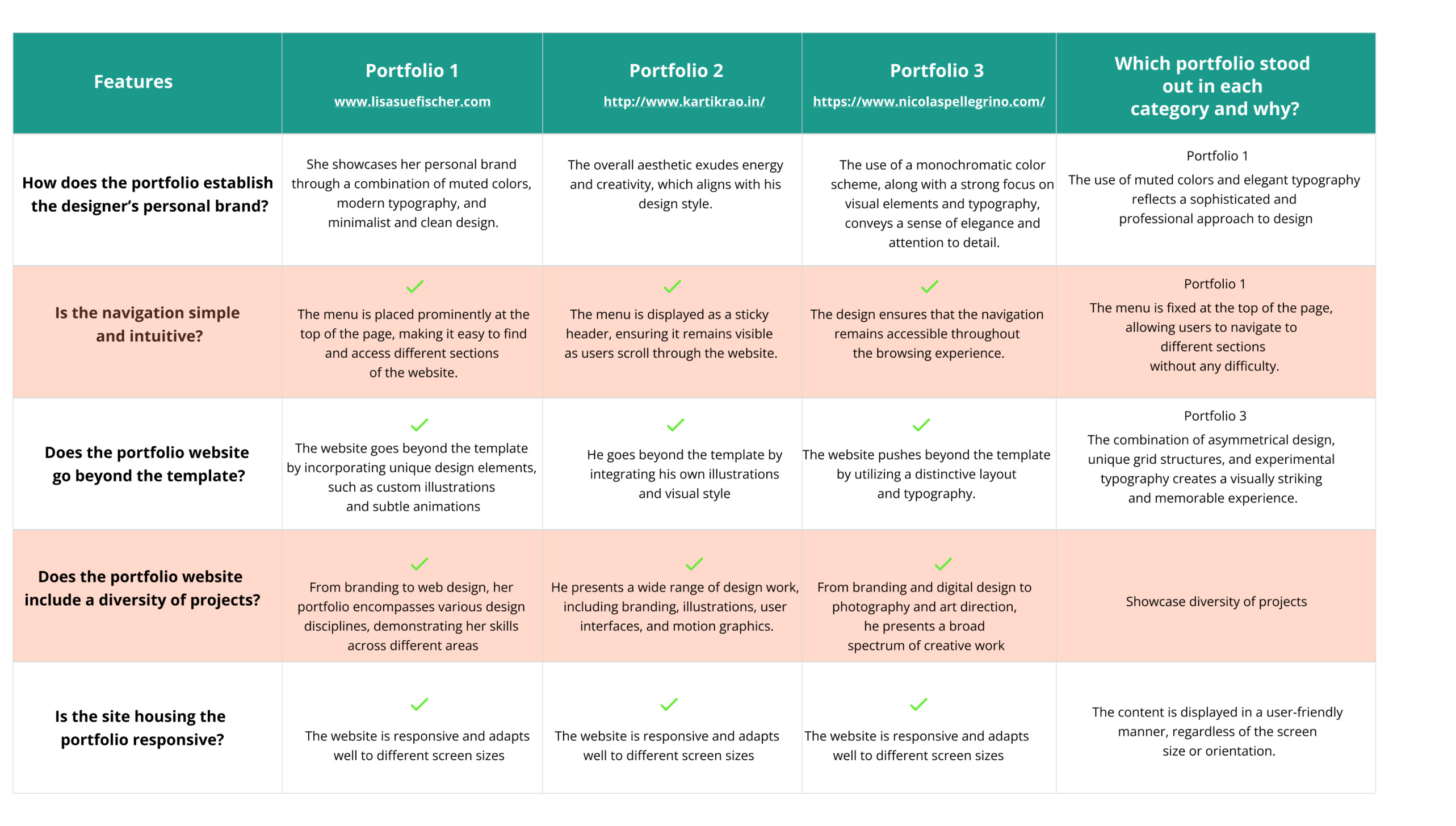
To understand the target audience and their expectations, I conducted user research by gathering feedback from fellow designers, recruiters, and friends. I also studied industry trends, competitor portfolios, and best practices in web design.
User research: Pain points
Difficulties in finding relevant information about the designer's skills, experience, and projects.
Lack of visual appeal and uniqueness in portfolio designs.
Confusing navigation and overwhelming content.
Limited interaction and engagement opportunities for visitors.
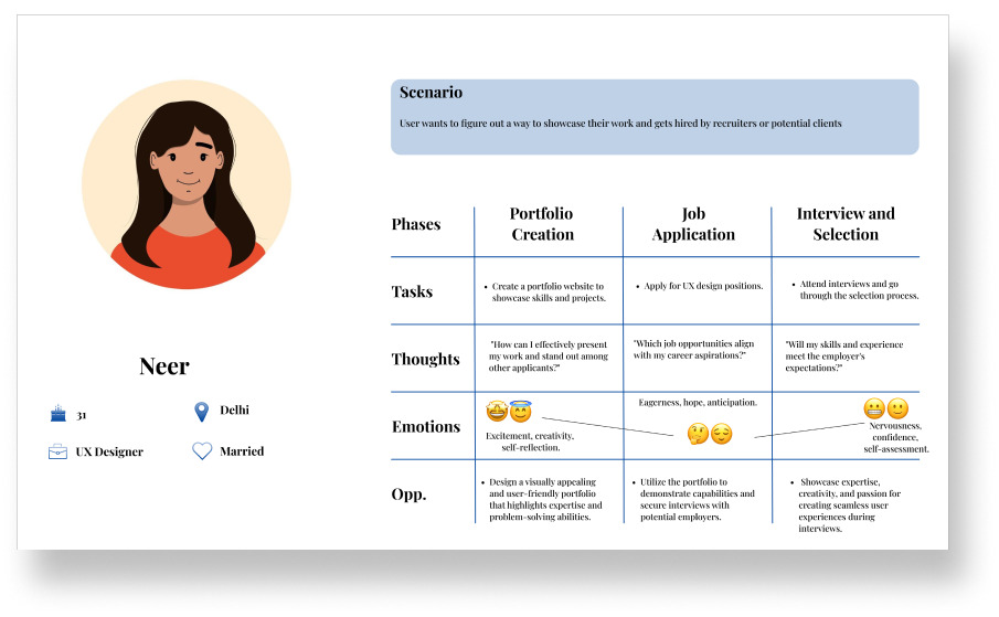
User personas were created to understand the target audience better. This included potential clients, recruiters, and fellow designers who were seeking inspiration and insights into the designer's capabilities.
To gain insights into the users' experience and identify potential pain points and areas for improvement, I developed a user journey map. This map enabled me to visualize the sequence of steps that users would go through when navigating my portfolio website.
Gained valuable practice while analyzing other designers’ portfolios. This has sharpened my own ability to recognize the elements of a good portfolio.
After ideating and drafting initial paper wireframes, I proceeded to create the initial designs for my UX portfolio project website and mobile site. The key focus was on developing a clear and intuitive information architecture, organizing my portfolio into sections such as About Me, Projects, Visuals, and Contact.
Usability study: findings
After conducting a comprehensive usability study to assess the effectiveness and user-friendliness of the portfolio website, valuable feedback from participants shed light on areas that required improvement. The findings revealed the need for clearer navigation labels, an enhanced visual hierarchy, and a streamlined presentation of content. These insights were instrumental in guiding the design refinements to create a more intuitive and engaging user experience.
1
Clear Information Hierarchy
Users expressed the need for a clear and intuitive information hierarchy on the portfolio website
Some users found it challenging to locate specific information or navigate between different sections of the website.
Some users appreciated engaging visuals, such as high-quality project images and interactive elements
These high-fidelity mockups were created to bring the final design of each webpage to life, capturing the refined visual elements, layout, and interactions. By aligning the high-fidelity prototype with the insights gained from the usability study, the design successfully translated user feedback into actionable design refinements, resulting in an improved and more polished user experience.
The high-fidelity prototype maintained the same user flow as the low-fidelity prototype, incorporating design changes based on the insights gathered from the usability study.
Handing over to Developer
After completing the design phase of the portfolio website, I closely collaborated with the developer to bring the design to life. Detailed design specifications, including high-fidelity mockups, assets, and style guides, were provided to guide the development process. We had regular discussions to clarify design requirements and address technical constraints, ensuring compatibility and performance optimization.
During front-end development, I worked closely with the developer to ensure pixel-perfect implementation, responsiveness, and smooth interactions. Simultaneously, the back-end development team built the necessary server-side functionality. By maintaining clear communication and collaboration, we seamlessly integrated dynamic elements and aligned them with the design vision.
We prioritized delivering a consistent user experience across devices and screen sizes, addressing responsive design challenges. The developer optimized assets for web performance while preserving visual quality. Integration with a content management system ensured both consistency and functionality.
Throughout the process, open communication, prompt issue resolution, and regular feedback loops were maintained to overcome challenges and ensure consistency. Our collaborative and detail-oriented approach enabled us to transform the design vision into a fully functional and impactful portfolio website.
During my first-hand experience collaborating with the developer, I gained valuable insights into the intricacies of translating design into functional code. It became evident that paying meticulous attention to details such as responsive design considerations, asset optimization, and browser compatibility is crucial for delivering a seamless user experience across various devices and platforms.
I learned that striking the right balance between the design vision and the feasibility of implementation is essential. It requires a deep understanding of technical constraints and the ability to make necessary compromises without compromising the overall user experience.
Each iteration in the design brought me closer to a more effective and user-friendly design, highlighting the power of incremental changes in enhancing the overall user experience.
Throughout the design journey, I discovered the delicate balance between creativity and usability. While I explored innovative ideas and incorporated unique visual elements, I realized the importance of ensuring that these design choices served a purpose and did not compromise usability. Subtle animations and interactions were strategically implemented to add a touch of creativity without detracting from the portfolio's primary objective.
Designing my own personal portfolio website has been a transformative experience, offering valuable insights and lessons that have shaped my approach as a UX designer. These learnings have equipped me with a deep understanding of the user-centered design process and the ability to create meaningful connections with users.
Moving forward, my next steps involve gathering feedback from peers and professionals to improve my portfolio design. I will incorporate this feedback to enhance the user experience and create an inclusive interface by integrating accessibility parameters. Additionally, I will regularly update my portfolio with new projects and achievements to showcase my growth as a UX designer.
The UX portfolio website successfully addresses the initial problem of showcasing skills and expertise in a user-centered manner. The website provides an engaging and informative experience for potential clients and employers, effectively highlighting the design process, projects, and achievements. Continuous refinement and updates will ensure the portfolio remains relevant and impactful in the dynamic field of UX design.
Thank you for your time reviewing my work on my Portfolio website! If you’d like to see more or get in touch, please drop a message.
Send message


