Cover photo
On this page

Project overview

Rent a home’ is a rental home website which aims to create an inclusive space for house renters where they can connect directly with house owners to schedule house visits and finalise a home. The typical user is between 21-70 years old, and most users are working professionals. The platform aims to simplify the process of finding rental homes by providing accurate and reliable property information to users.

Challenge

The rental home search process in urban Indian cities is complex and time-consuming due to the fragmented market, limited transparency, and varying user preferences. Users struggle to find suitable rental homes efficiently, leading to frustration and dissatisfaction.

Available rental home websites have cluttered designs with minimal filters, lot of ads, insufficient details, poor quality images and paid plan restriction to connect with house owners. Pricing details are often misleading with hidden charges.

Objective

Create a digital user experience (responsive website) that prioritizes user convenience by ensuring smooth and intuitive navigation, while also providing reliable and authentic information to ensure thorough screening of houses before finalizing a booking.

Role

UX designer leading the ‘Rent a home’ website design

Responsibilities

Conducting interviews, paper and digital wireframing, low and high-fidelity prototyping, conducting usability studies, accounting for accessibility, iterating on designs and responsive design.

Project duration

Jan 2023- Mar 2023

Understanding the user

User research: summary

I conducted user interviews and turned them into empathy maps to better understand their preferences, challenges, and expectations when searching for rental homes. I discovered that many target users visit rental home websites when they relocate to a new city or area, and they do not have many offline contacts to reach out to. However, many rental websites are overwhelming and confusing to navigate, which frustrates many target users. This causes a delay in finding homes and takes more time to verify and screen properties before final booking. Available rental home websites have cluttered designs, a lot of ads, insufficient details, poor-quality images, and paid plan restrictions to connect with homeowners. We aim to provide convenience to users to ensure proper house screening before booking.

I conducted observations of some users interacting with existing rental platforms to identify common pain points, such as complex search filters and outdated property listings.

User research: Pain points

Cumbersome navigation

Rental website navigation is too complicated, with small interactive elements (such as text size, heading hierarchy, unrecognizable icons without text, images, and call-to-action buttons) and frequent login requests between screens.

User interface

Unclear images and improper descriptions in small text fonts often make it difficult and inconvenient to select a property and reach out to the owner.

Lack of Trust and Verification

Skeptical about the authenticity and reliability of property listings due to the limited or nonexistent verification processes in place.

Digital experience

Online rental websites often fail to provide an engaging browsing experience due to clutter, hidden charges, inflexible filter options, and poor-quality images.

User personas

Huma Saeed is a busy doctor who needs an inclusive website with intuitive website navigation and search filters because they want to quickly shortlist a home for moving in.

Persona photo and summary

Feature analysis

To learn a little bit more about the market, I observed and analyzed several competitors and noted some of the features they were offering their users.

Persona photo and summary

User journey map

I created a user journey map of Huma's experience using the site to identify possible pain points and improvement opportunities.

Persona journey map

Ideation

Crazy 8 exercise

Using the gap or opportunity identified above, I sketched eight different ideas that propose solutions to the gaps or opportunities. This crazy-8 method gave a kick start to explore possible and alternative solutions

...

Sitemap

Difficulty with website navigation was a primary pain point for users. I used this knowledge to create a sitemap with the goal of making strategic information architecture decisions that would improve overall website navigation. The structure I chose was designed to make things simple and easy.

Persona journey map

Starting the design

Paper wireframes

Next, I sketched out paper wireframes for each screen in my app, keeping in mind the user pain points about navigation, browsing, and interaction around property shortlist and house visit scheduling. The home screen paper wireframe variations to the right focus on optimizing the browsing experience for users.

Persona journey map

Stars were used to mark the elements of each sketch that would be used in the initial digital wireframes

Paper wireframe screen size variations

Because Rent a home’s customers access the site on a variety of different devices, I started to work on designs for additional screen sizes to make sure the site would be fully responsive.

Persona journey map

Digital wireframes

Moving from paper to digital wireframes made it easy to understand how the redesign could help address user pain points and improve the user experience. Prioritizing useful button locations and visual element placement on the home page was a key part of my strategy.

Persona journey map
Persona journey map

Digital wireframe screen size variation(s)

Persona journey map

Low fidelity prototype

To create a low-fidelity prototype, I connected all of the screens involved in the primary user flow of shortlisting a property, going through virtual tour and scheduling an appointment for house visit.

At this point, I had received feedback on my designs from participants about things like placement of buttons and page organization on landing page, login requests and applying filter. I made sure to listen to their feedback, and I implemented several suggestions in places that addressed user pain points.

Usability study

I conducted two rounds of usability studies. Findings from the first study helped guide the designs from wireframes to mock-ups. The second study used a high-fidelity prototype and revealed what aspects of the mock-ups needed refining

Parameters

Study type

Unmoderated usability study

Location

India, remote

# of participants

8 participants

Time

40-45 minutes

Findings

1

Login/sign up

Once on the landing page, the users were asked to sign/up first to access the detailed content

2

Filters

Users weren’t able to apply filters to personalize their search results. They wanted a streamlined search to save time and effort

3

Landing page

Users were confused about landing page and home page, it should be one page with access and easy navigation to different pages of the websites.

Synthesizing the data

Creating an affinity diagram helped me to group together research insights to further understand and define the problems in the product design.

...

Refining the design

To make the browsing experience hassle-free for users, I ensured that users get login/sign up prompt when they shortlist a property or when they are trying to schedule a house visit. This will help them to track the properties they’re interested in through a profile dashboard.

Before usability study
...
After usability study
...

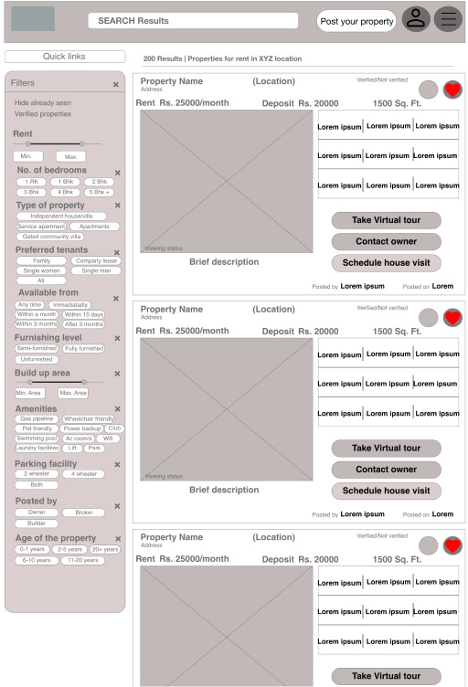
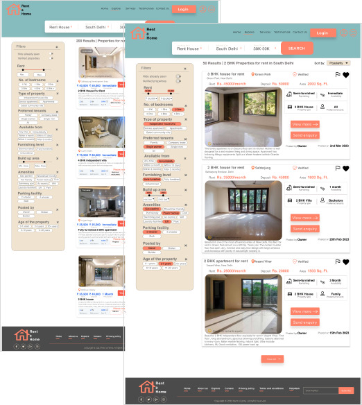
To help the users to make contextual search with specific requirements, I ensured that they are able to apply filters to choose from relevant properties without wasting much time. This will help them to choose the properties they’re interested in and take the required action quickly.

...
...

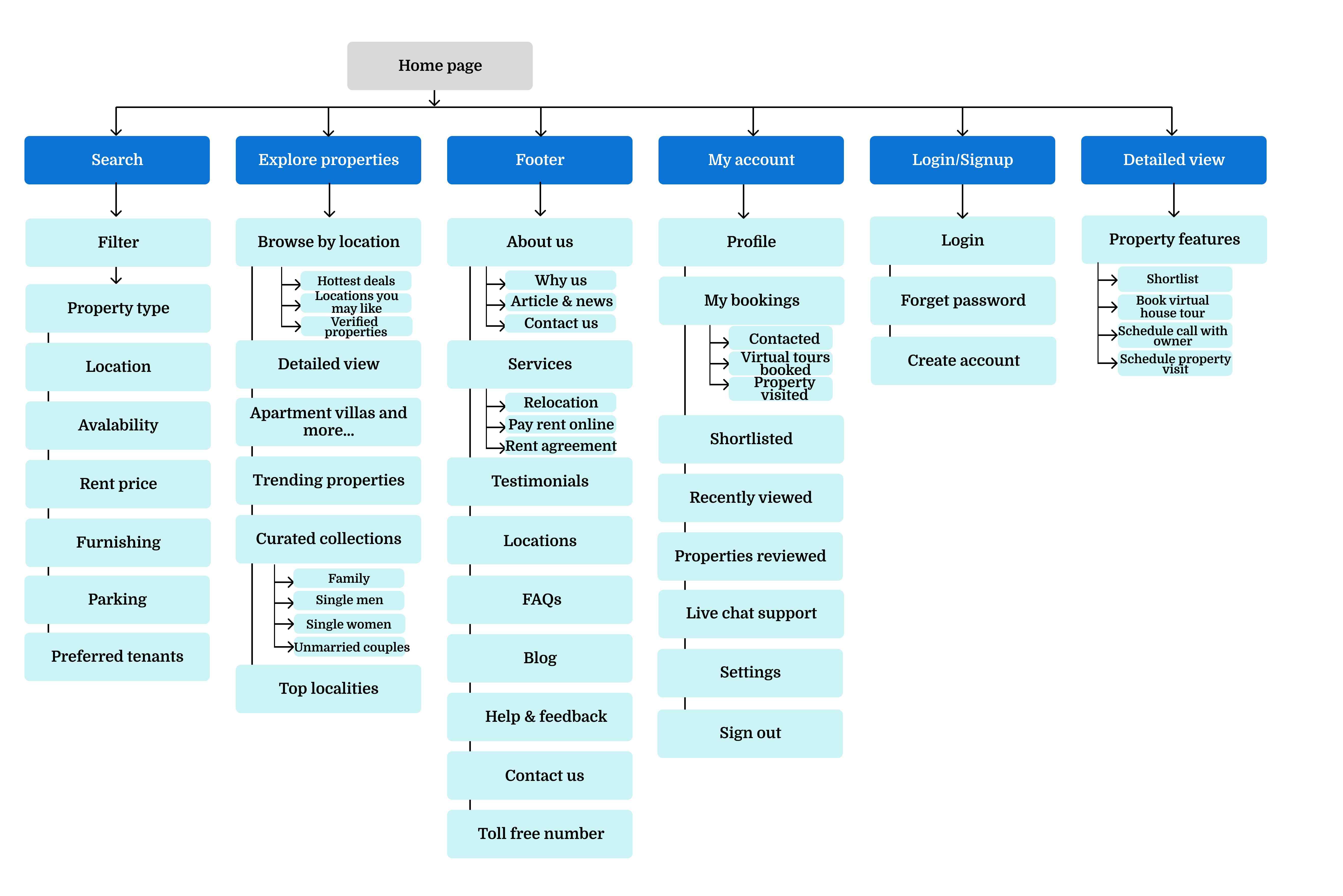
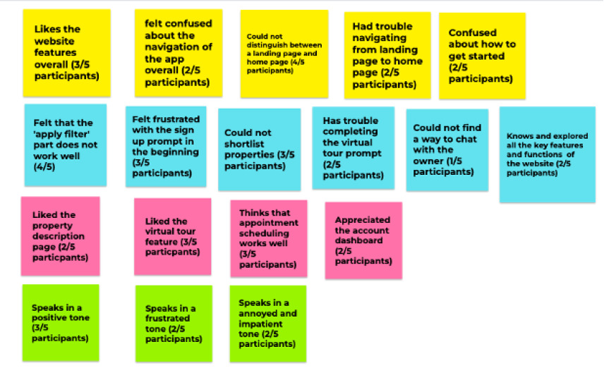
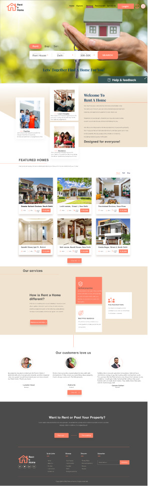
Based on the insights from the usability study, I made changes to improve the user experience on the home. One of the changes I made was merging the landing and home page components to avoid the confusion in navigation between these pages. This allowed users more freedom to understand the overall features of the website and accessibility to different pages of the website..

...
...

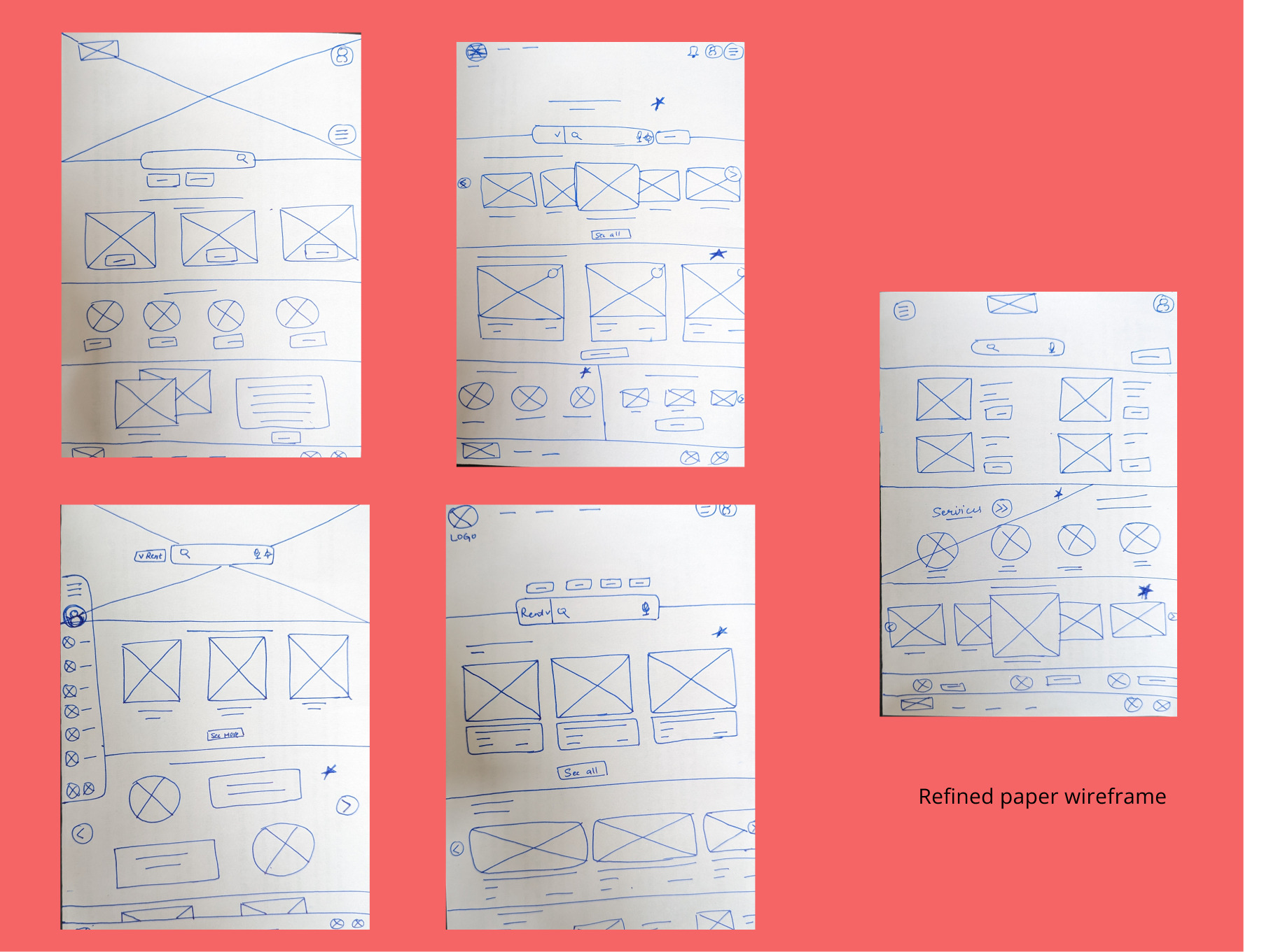
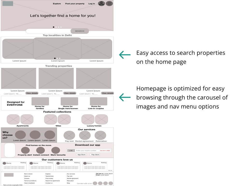
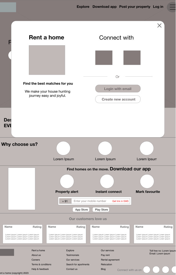
Mockups: Original screen size

Persona journey map

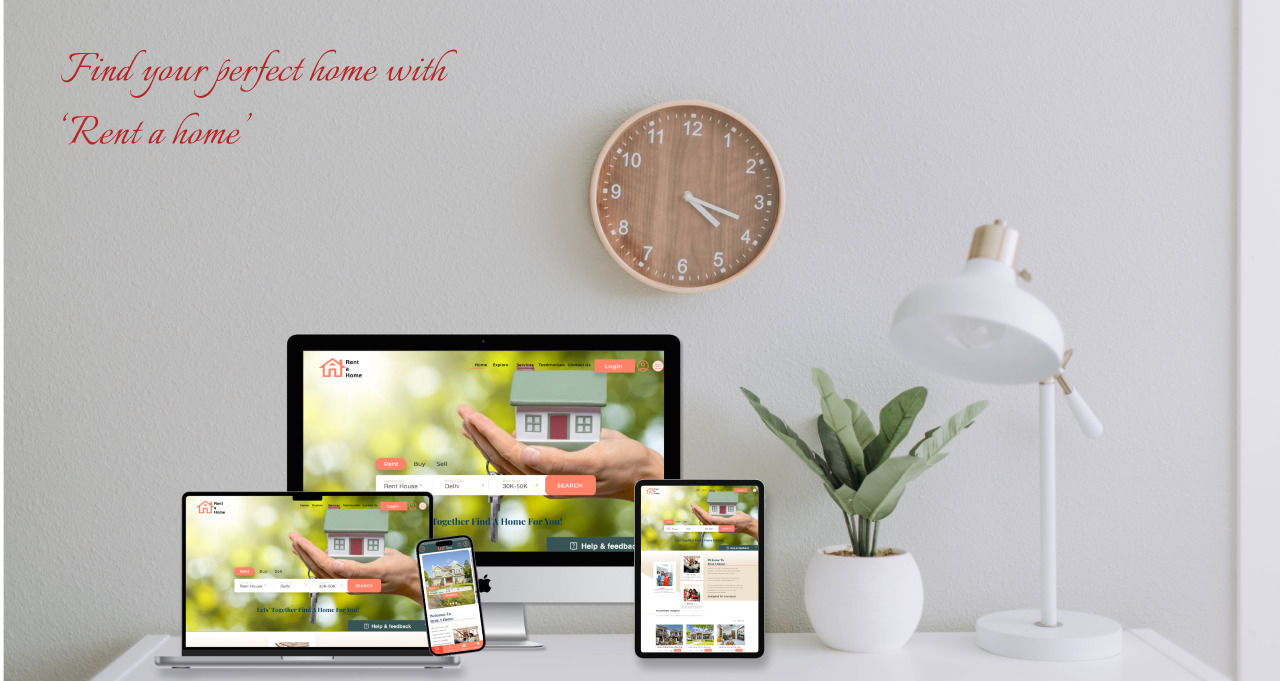
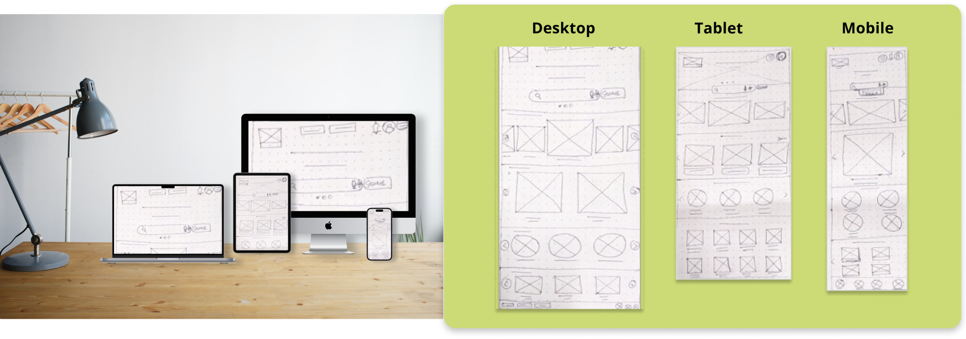
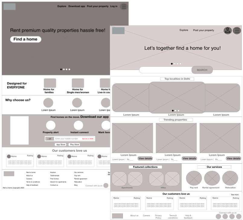
Mockups: Screen size variations

...

I included considerations for additional screen sizes in my mockups based on my earlier wireframes. Because users browse and make search from a variety of devices, I felt it was important to optimize the browsing experience for a range of device sizes, such as mobile and tablet so users have the smoothest experience possible.

High fidelity prototype

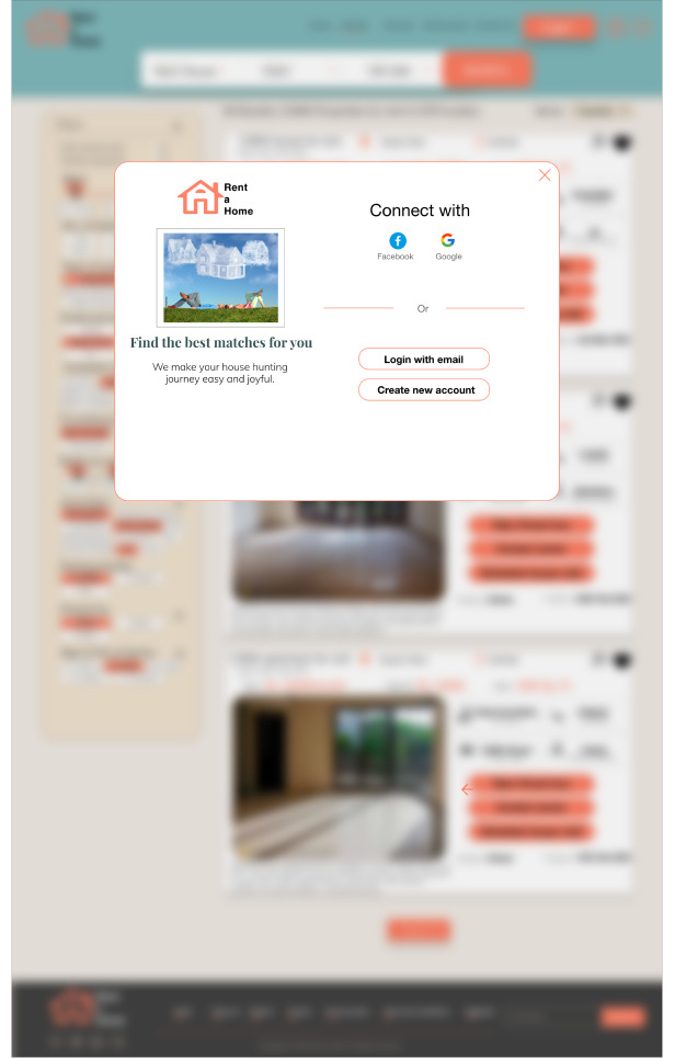
My hi-fi prototype followed the same user flow as the lo-fi prototype, and included the design changes made after the usability study, as well as several changes suggested by my friends and peer group.

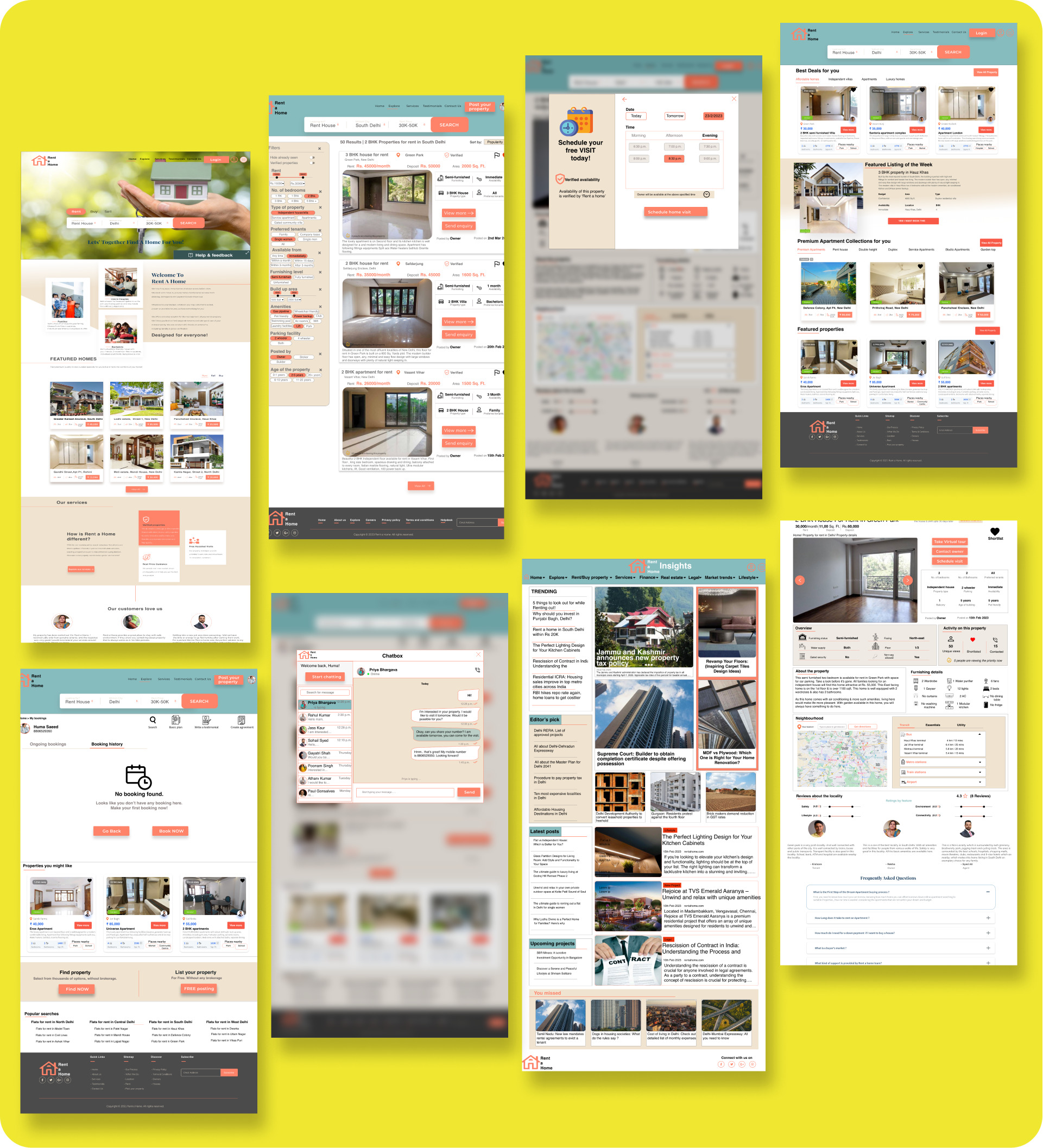
The final high-fidelity prototype presented cleaner user flows for finding rental homes from start to end. It also met user needs for correct and up-to-date information, advanced search filters, connecting with homeowners, and accessibility in terms of colors, font size, and the use of alt text for images.

Developed a visually appealing and consistent brand identity for Rent a Home that resonates with the target audience. For example, using a combination of warm colors and modern typography to convey trust, professionalism, and reliability.

Accessibility considerations

1

I used headings with different sized text for clear visual hierarchy for screen readers

2

I used landmarks to help users navigate the site, including users who rely on assistive technologies

3

I designed the site with alt text and labels available on each page for smooth screen reader access

Going forward

Impact:

I gathered feedback on the overall user experience, ease of use, and satisfaction with features such as search, filters, and property details. Users appreciated the fact that the platform offers detailed property information, high-quality images, a chat option, and virtual tours. This will help users gain a comprehensive understanding of the properties before scheduling viewings. Our target users shared that the design was intuitive to navigate through, more engaging with the images, videos, and descriptive text, and demonstrated a clear visual hierarchy.

What I learned

I learned that even a small design change can have a huge impact on the user experience. I tried to create a simple design where users feel free to click and explore any space they like.

The most important takeaway for me is to spend considerable time identifying the real needs of the users and brainstorm harder to solve the problem in a simple, intuitive way. Attention to detail, consistency, and a mobile-first approach were essential in creating a polished and responsive app interface.

Next steps

1

Conduct follow-up usability testing to focus on intuitive navigation, real-time notifications, and easy communication features to ensure a smooth rental home search process.

2

Identify any additional areas of need and ideate on new features e.g. basic plans, website services, refined search functionality

3

Incorporate features that enable users to share property listings, seek recommendations from friends, and engage in discussions within the app.

Let's connect

Thank you for your time reviewing my work on the 'Rent a home' project! If you’d like to see more or get in touch, please drop a message.

Send message