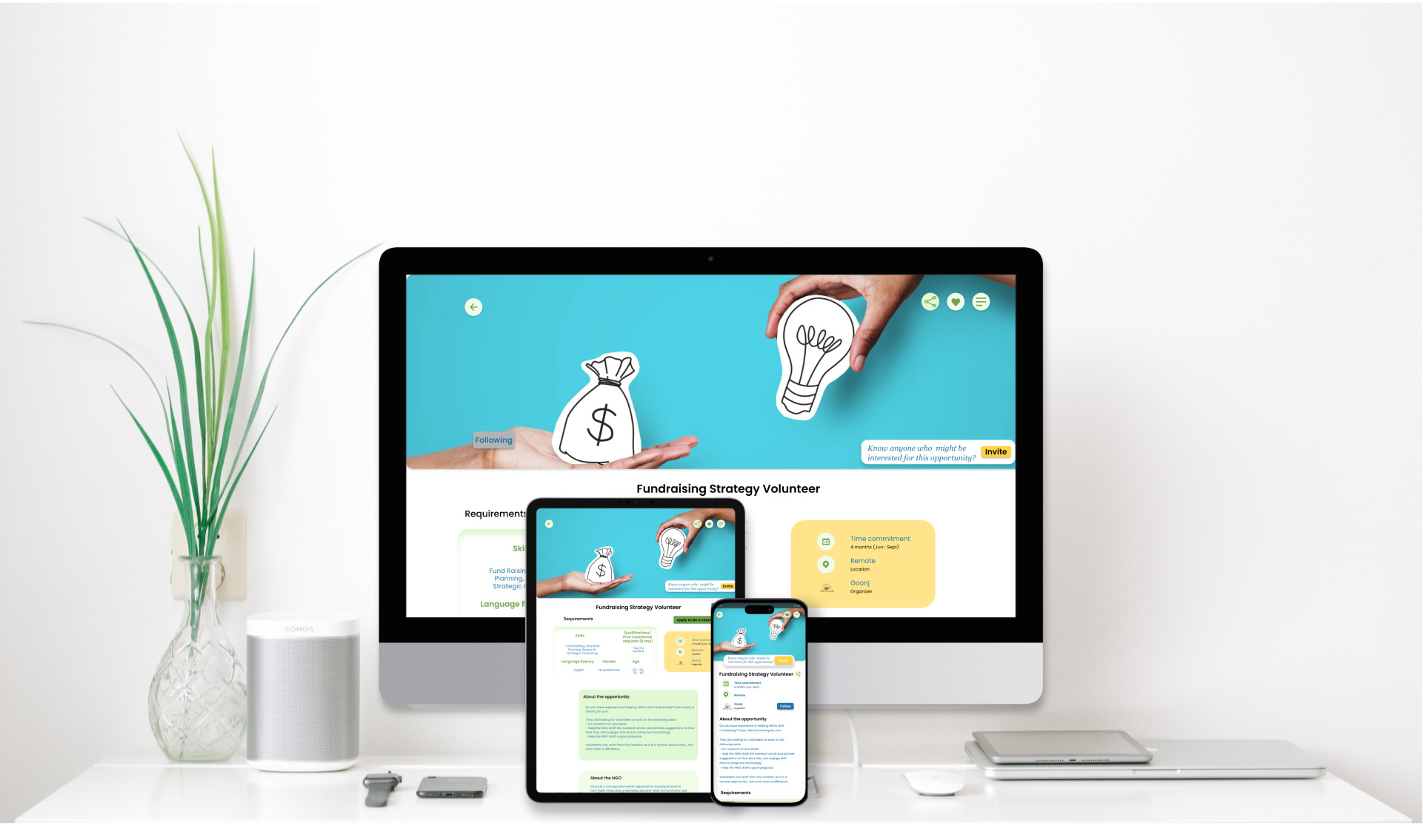
Cover photo
On this page

Project overview

Thrive TOGETHER is a Delhi-based organization focused on engaging people in community service through short- and long-term projects, events, and fundraisers. The organization needed a tool that helps people find interesting volunteering opportunities that leverage their skills and connect them with like-minded people. Thrive's primary target users include college students and adults who care about their communities and are looking for ways to get involved in community service.

Challenge

There are millions of non-governmental organizations (NGOs) working in the country, but the percentage of people who are aware of the social development work they do is very low. The problem is that many individuals who are interested in participating in local community service often face challenges in finding relevant opportunities and connecting with like-minded people.

This makes the rate of involvement in local community projects low.

People often lack motivation and face an information gap about how to contribute and connect with the right people to contribute. We identified a lack of knowledge about possible ways of volunteering and the option to get involved according to time availability, interest areas, and skills as some of the major factors inhibiting people from getting involved actively.

Objective

Design a cross-platform user experience that will help people access timely information about various community service projects and volunteering opportunities, and connect with nearby NGO projects hassle-free.

Role

UX designer leading the app and responsive website design from conception to delivery

Responsibilities

Conducting interviews, paper and digital wireframing, low and high-fidelity prototyping, conducting usability studies, accounting for accessibility, iterating on designs, determining information architecture, and responsive design.

Project duration

March - May 2023

Design process

Persona journey map

Understanding the user

User research: summary

My prior experience in the social development sector and in volunteering was leveraged to develop interview questions, which were then used to conduct user interviews. Most interview participants reported feeling confused about not knowing volunteering options, but they didn't actively try to figure out how to go about it or where to start. Some people want to contribute but actually don't know where to start. The feedback received through research made it very clear that users would be open and willing to contribute in their free time, mostly as per convenience, by leveraging their resources (time, skills, and money) if they had access to an easy-to-use tool to help guide them.

User research findings

1

Need some space which nurtures a sense of belonging and facilitate knowledge sharing

2

Scope of collaborative projects based in their local communities

3

Tailored project recommendations and activities based on the interests and skills.

4

Users expressed a strong desire for networking and collaboration opportunities.

User personas

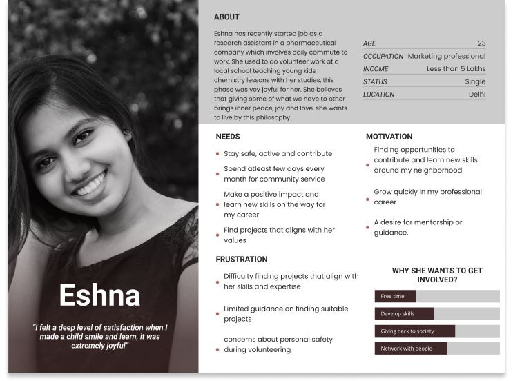
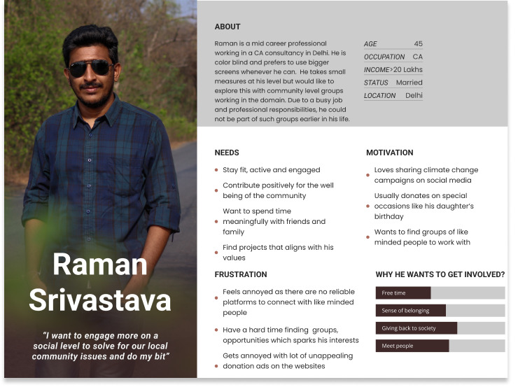
Developed user personas based on the research findings to represent the target audience. Personas included individuals from diverse backgrounds, such as college students, working professionals, and retirees, who were passionate about community service but faced barriers in engagement.

...

Eshna Kaur is a young professional who needs to find meaningful projects to engage and advance in career because she wants to make a difference in other people’s lives and gather new skills on the go.

Raman Srivastava is a Mid-career professional who needs to connect with like minded people around to engage with community service activities because he wants to utilize his time meaningfully and serving his community along the way.

...

User journey map

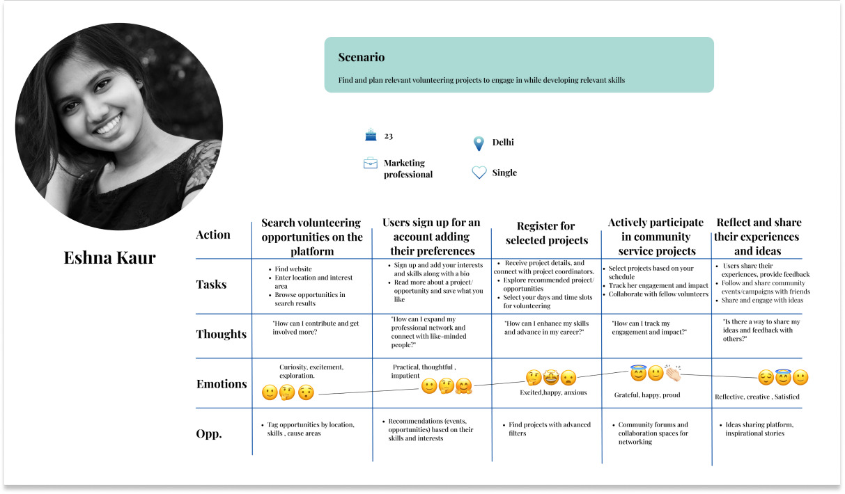
Created a user journey map to understand the end-to-end experience of users in their community service engagement. Mapped touchpoints, emotions, pain points, and opportunities for improvement throughout the journey, including discovering opportunities, registration, project participation, and post-engagement reflection.

Persona journey map

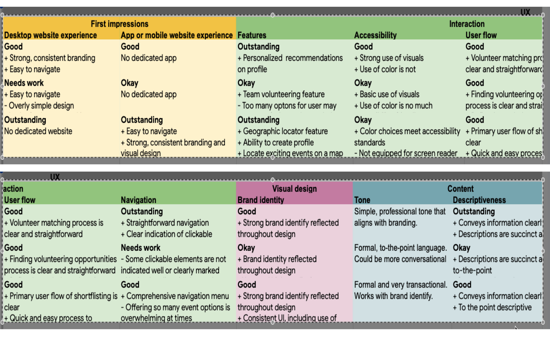
Competitive audit

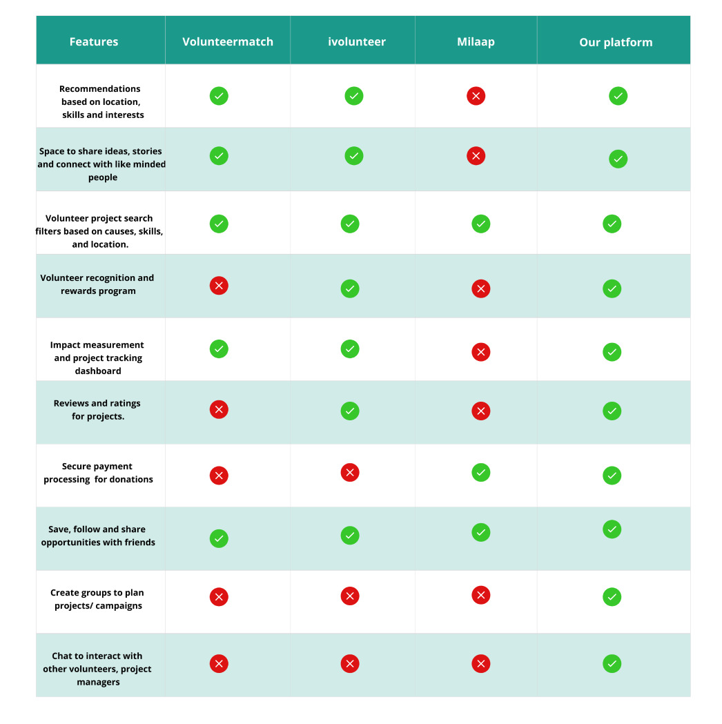
An audit of a few competitor’s products (features and UI) provided direction on gaps and opportunities to address with the ‘Thrive together’ app.

Persona journey map

Feature analysis

Persona journey map

Ideation

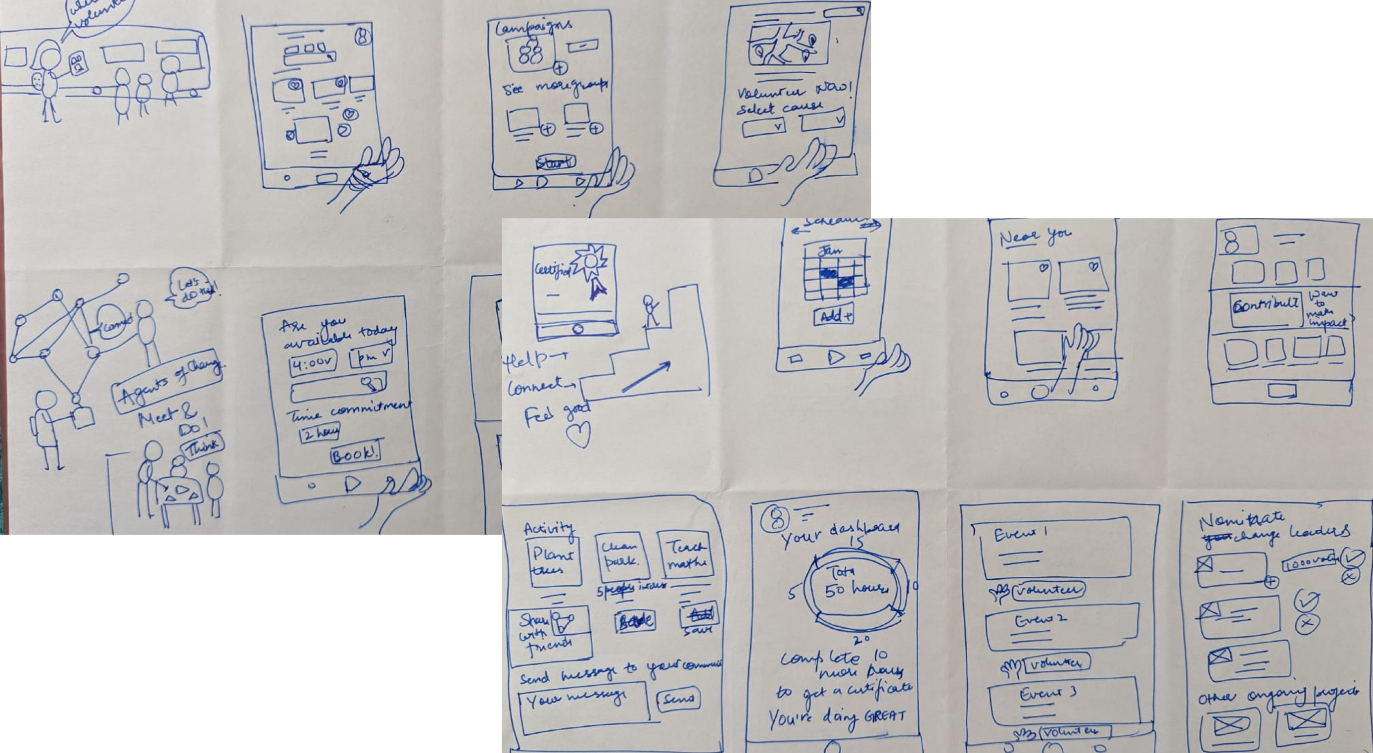
I conducted a quick ideation exercise to come up with ideas for how to address gaps identified in the competitive audit. My focus was specifically on finding volunteering opportunities in different cause areas, events happening, and fundraisers to contribute to.

Persona journey map

Starting the design

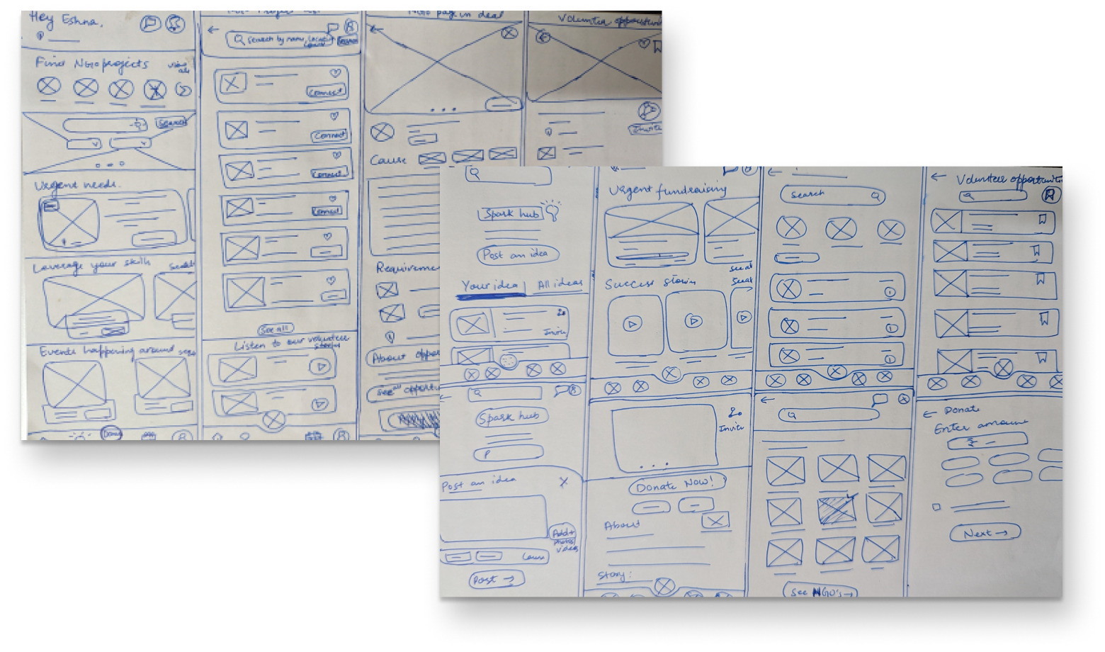
Paper wireframes

Next, I sketched out paper wireframes for each screen in my app, keeping the user pain points in mind.

Persona journey map

Digital wireframes

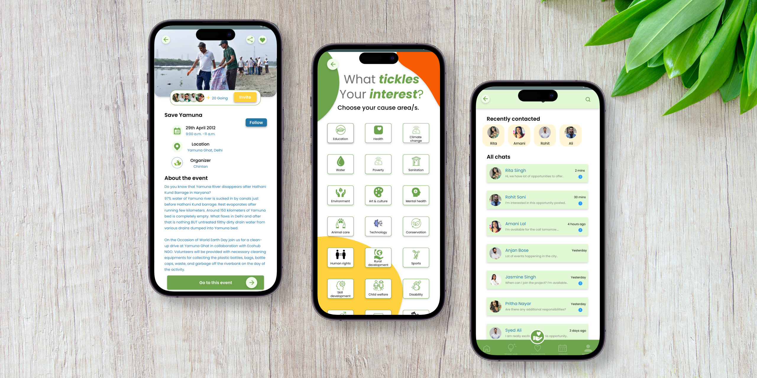
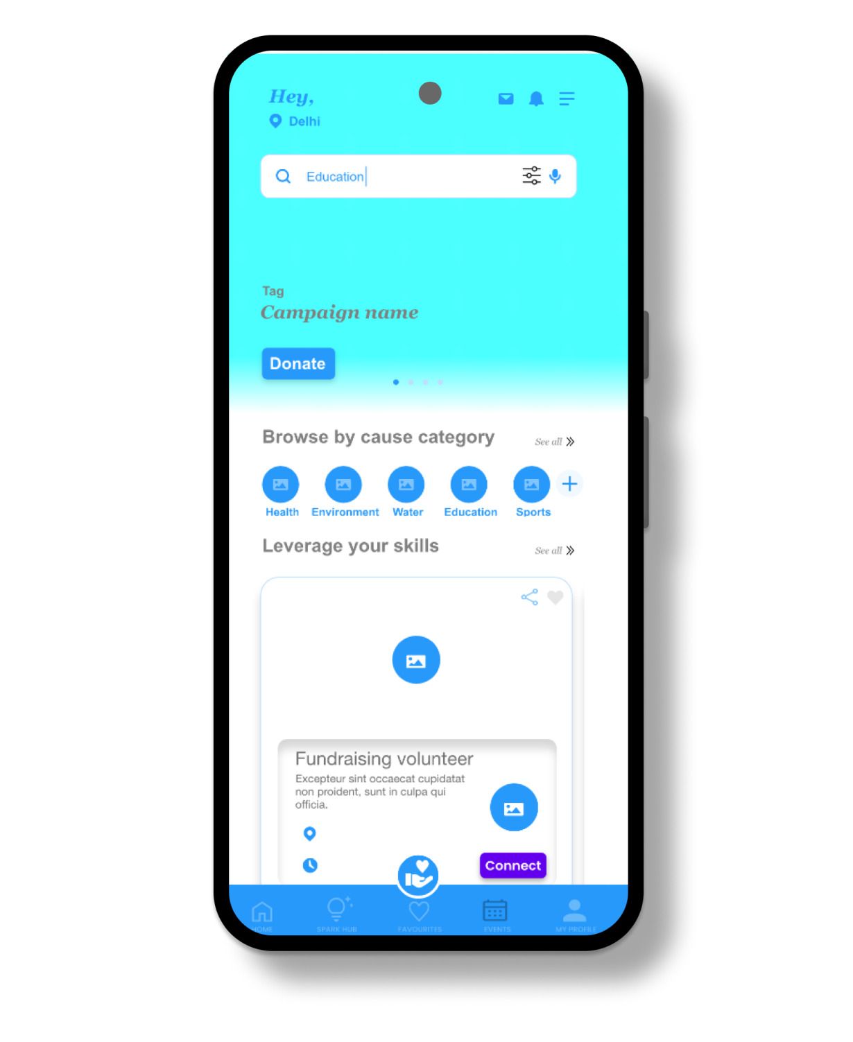
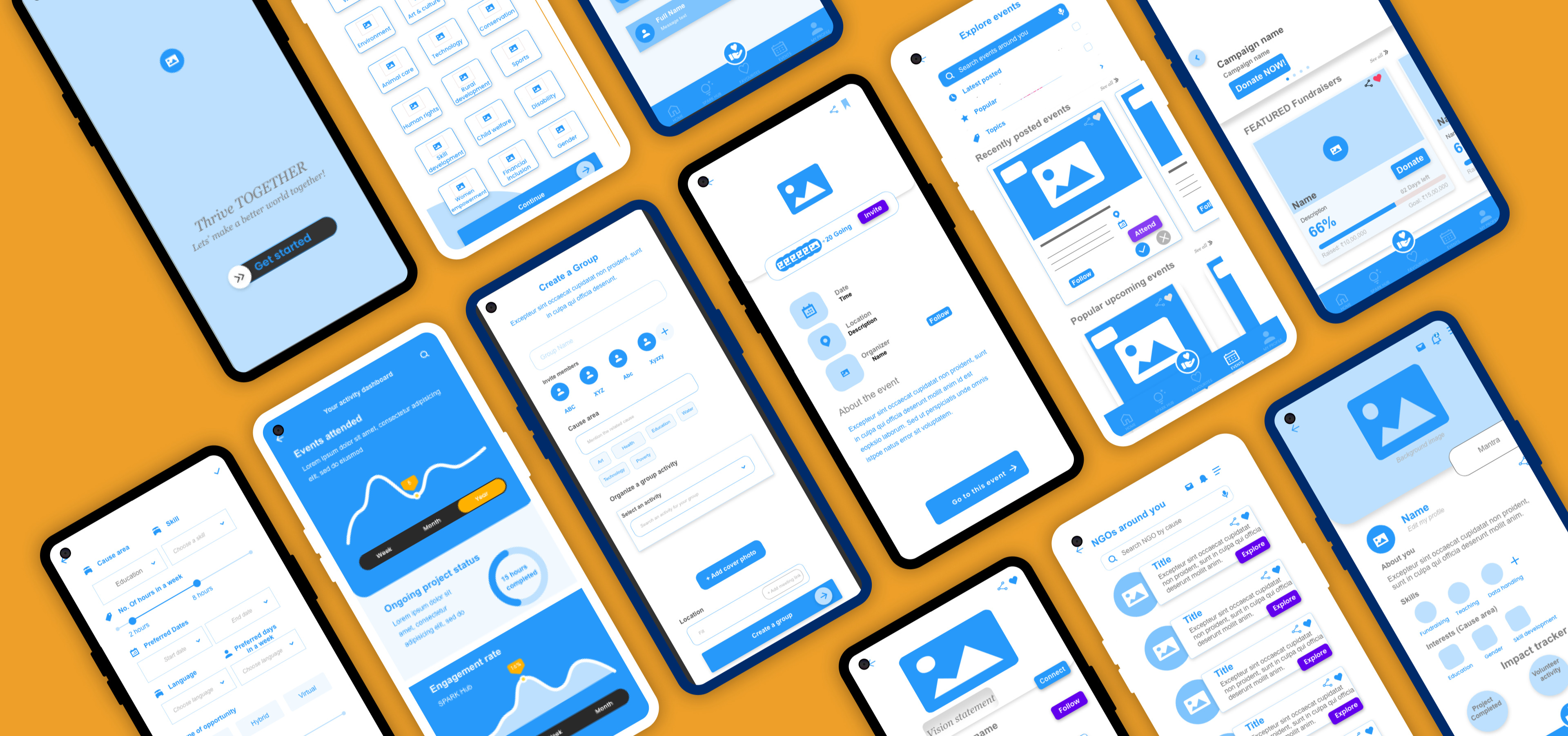
After ideating and drafting some paper wireframes, I created the initial designs for the Thrive Together app. These designs focused on helping users explore different volunteering opportunities and connect with the right individuals.

Top half of home screen contains different options by providing personalized recommendations for users.

...

Easy access to app features from global navigation

Persona journey map

Low fidelity prototype

To prepare for usability testing, I created a low-fidelity prototype that connected the user flow of finding volunteering opportunities and making a connect ,attend events,donate to fundraisers and read/watch stories of change.

Usability study: findings

I conducted two rounds of usability studies. Findings from the first study helped guide the designs from wireframes to mock-ups. The second study used a high-fidelity prototype and revealed what aspects of the mock-ups needed refining

Parameters

Study type

Moderated usability study

Location

India, remote

# of participants

8 participants

Time

45-60 minutes

Findings

1

Volunteering opportunities

People want easy access to find opportunities based on the location, time availability and their interests

2

Navigation

People had difficulty connecting with selected opportunities. The forward and backward navigation to the home page was not smooth. Users could not easily find the page to post/share ideas and favorites from the home page or menu.

3

Features

Some users would like to have a functionality to connect to like minded people nearby to do/organize volunteering activities together.

Refining the design

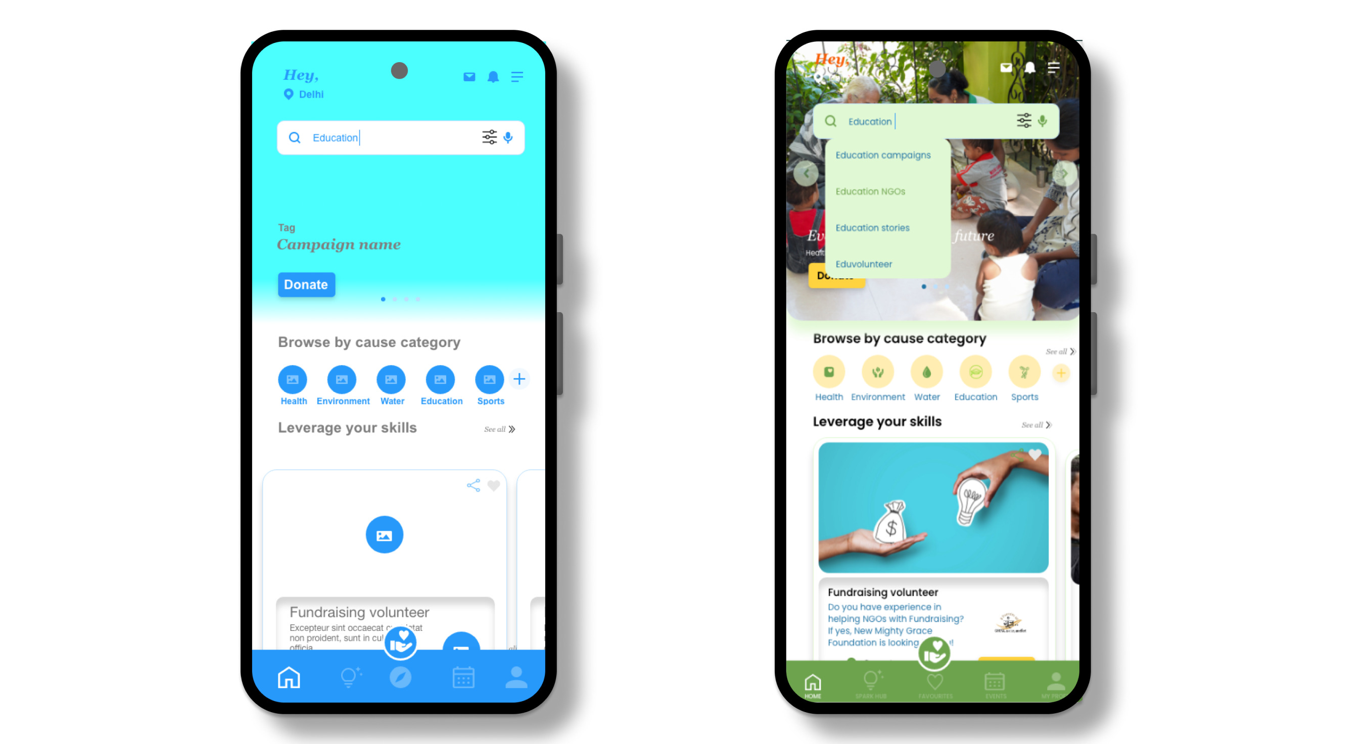
Based on the insights from the usability studies, I applied design changes such as call-to-action buttons to access different sections of the app on the home screen. I also changed the buttons on the bottom navigation to directly access favorites (saved opportunities), and linked the activity dashboard with the volunteer profile.

Persona journey map

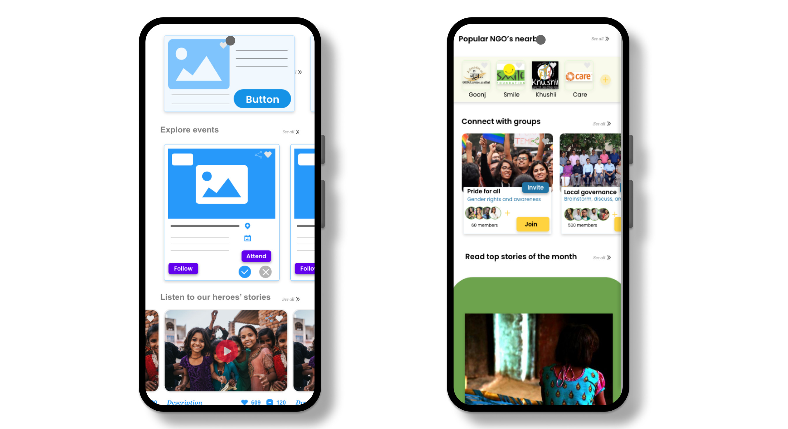
Based on the insights from the usability studies, I provided option to meet and connect with people by joining groups , create own group to organise and plan activities.

Persona journey map

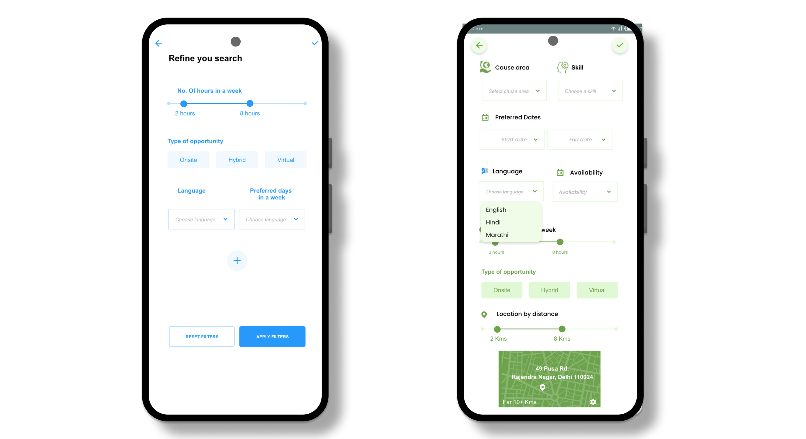
Improved the visibility and usability of search filters: I provided advanced filtering options to refine the search query and recommend opportunities basis that. This made it easier for users to refine their search based on their specific criteria.

Persona journey map

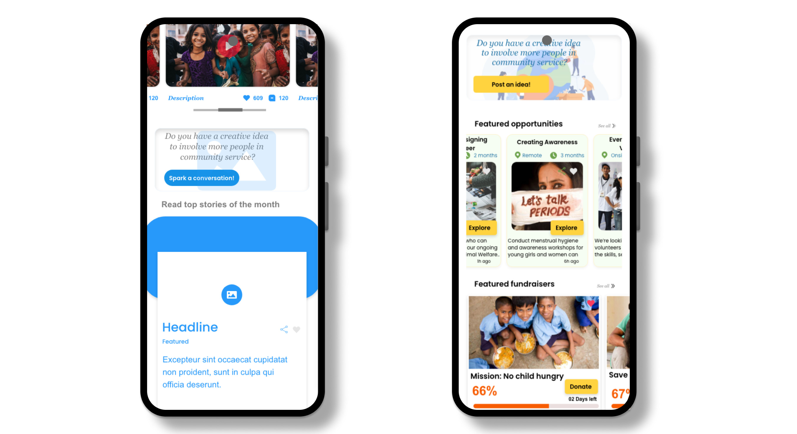
Design changes include adding a clear call-to-action (CTA) button on the home page to post an idea and access the SPARK hub. The button has also been repositioned on the home page to make it easier to find.

Persona journey map

Mockups

Persona journey map

High fidelity prototype

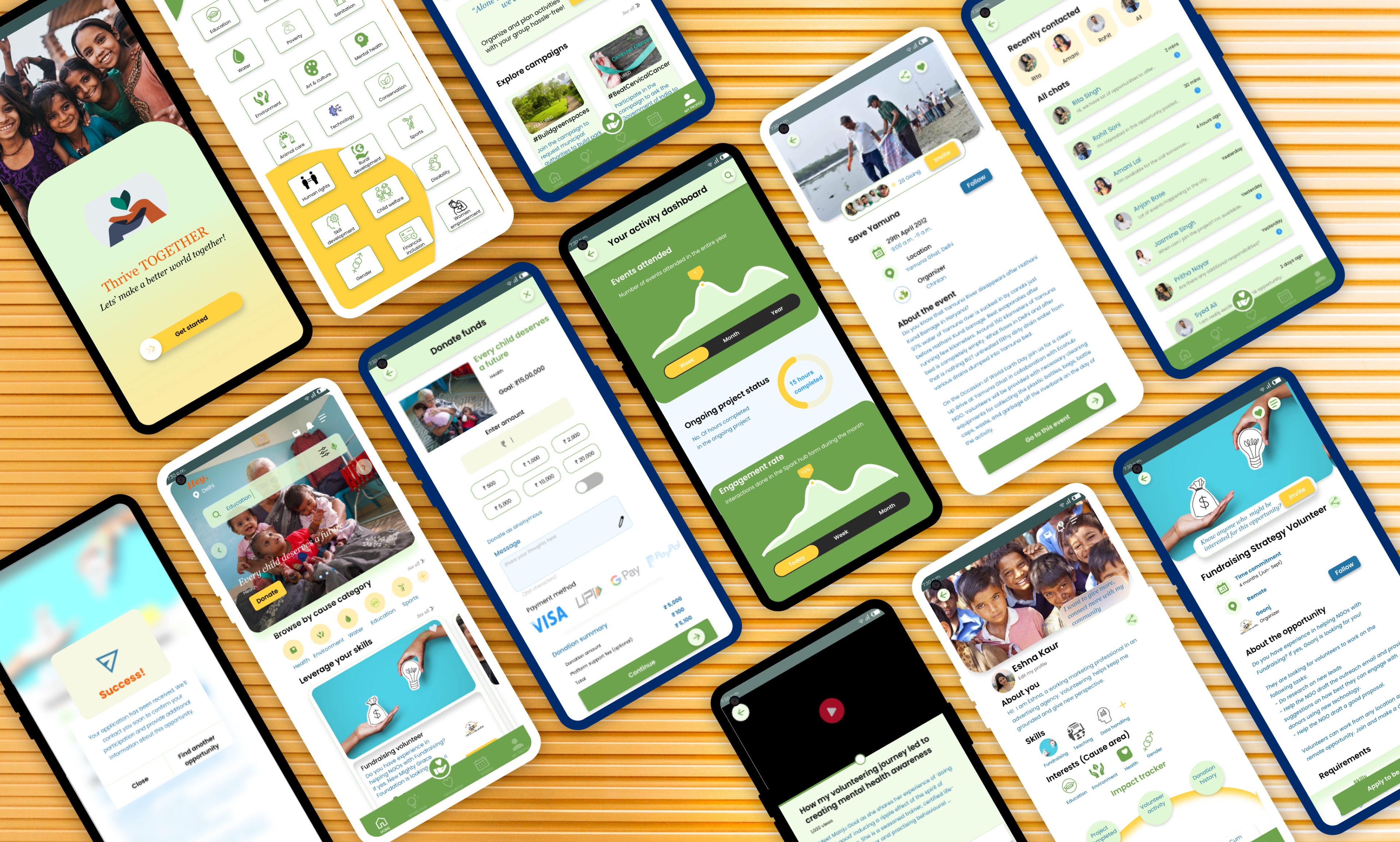
The high-fidelity prototype followed the same user flow as the low-fidelity prototype, including design changes made after the usability study.

Accessibility considerations

1

Text Alternatives: Provide alternative text descriptions (ALT text) for images, allowing users with visual impairments to understand the content of the images through screen readers.

2

Personalized recommendations, multiple filter options and clear language of the main user task buttons help the user to perform the primary tasks. Home page has been linked to all the main sections of the app

3

Clear language, high contrast colors and borders for overlays and pop-ups for users to give prompts if a task is completed or not.

Sitemap

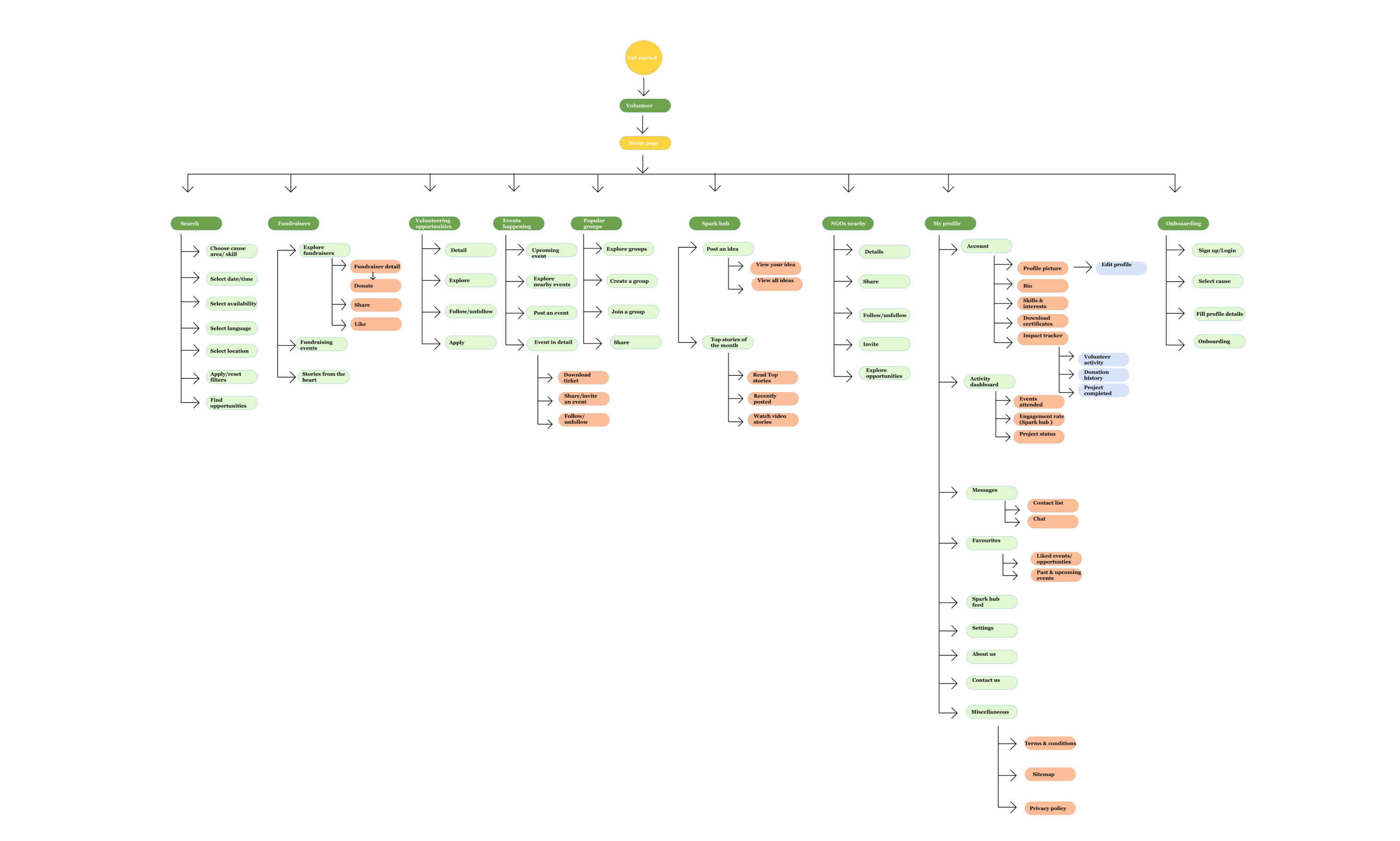
With the app designs completed, I started work on designing the responsive website. I used the Thrive TOGETHER sitemap to guide the organizational structure of each screen’s design to ensure a cohesive and consistent experience across devices.

Persona journey map

Resposive design

The designs for screen size variation included mobile, tablet, and desktop. I optimized the designs to fit specific user needs of each device and screen size.

Persona journey map

Going forward

Takeaways

In one memorable anecdote, a user became frustrated when trying to select a fundraiser to donate to. They could not find the donate button after selecting a fundraiser, and therefore did not complete the action. This reemphasized the importance of clear visual hierarchy and intuitive interaction patterns, prompting me to refine the design further.

Users appreciate the ability to connect with like-minded individuals and local organizations, which creates a sense of belonging and fosters community engagement.

Users shared that the app made volunteering more accessible and easy to initiate on their own terms. One peer feedback quote was: "The Thrive app actually made me feel that there are so many ways to contribute locally. It gave me a direction to start with."

What I learned

I learned the importance of leveraging one's own life experiences and prior knowledge while solving a particular issue, without allowing biases to cloud the process. This understanding guided my thought process and helped me articulate clear research questions to pursue further.

Throughout the design process, it remained crucial to prioritize the user's perspective, constantly evaluating whether each element, piece of text, or a flow made sense from their point of view.

Additionally, I recognized the significance of setting limits and boundaries, ensuring that the main problem stayed at the forefront to maintain clarity and avoid confusion during the design process.

Next steps

1

Conduct another usability study on how helpful the app is in reaching the goal of finding volunteering opportunities and discover new features

2

Add more opportunities from various local NGOs and collection of success stories (articles,video resources)

3

Provide incentives and rewards to users for referring the app to other users in the network.

Let's connect

Thank you for your time reviewing my work on the 'Thrive together' project! If you’d like to see more or get in touch, please drop a message.

Send message